1. What I used to be:
I used to be a lot more lazier than what I am now; always leaving things until the last minute and procrastinating. Also quite dismissive of other peoples work and also of their opinions if I didn't like their work in the first place. I was also too careful with my approach to design and didn't ever like being pushed out of my comfort zone. My time management was appalling, although somehow I was always confident that I would be able to pull something out of the bag and make whatever I was doing... work.
2. What I am now:
Nowadays, I am much more informed and aware that experimentation and inspiration are the key to developing as a designer. Other peoples opinions are also invaluable, even if I don't always like what I hear initially. My time management is a lot better, although I still have a way to go I think before I become truly efficient... I definitely understand that I can't pull something out of the bag all of the time. It just doesn't work like that.
3. First thing that I intend to become:
More routine with my sleeping patterns and efficient with my time management.
4. Second thing that I intend to become:
Respected for my skills and for my opinions on design.
5. Third thing that I intend to become:
Employable and the best that I know I can be.
Simple in theory, tougher in practice. I will get there.
x
Thursday, 30 April 2009
Wednesday, 29 April 2009
PPD Session 01
This focus of this session was to discuss our personal and developing interests of 5 selected pieces of contemporary design. For me they were as follows:
1. Cristiana Couceiro

2. Jacob Arden McClure

3. Patrick Morgan

4. Olivier Kugler

5. H.N Werkman

1. Cristiana Couceiro

2. Jacob Arden McClure

3. Patrick Morgan

4. Olivier Kugler

5. H.N Werkman

Tuesday, 7 April 2009
Type and Grid Pt. 01
Being briefed on the type and grid workshops last week was quite an experience and definitely an eye-opener to myself and many others I am sure. I guess I have never truly understood just how much detail goes into designing a page layout be it in a book, magazine, newspaper, website or leaflet... the list is endless if I'm honest.
Moving on however, the brief itself was to produce a fully laid out editorial article of the our creative partner; who is in this instance is the delightful Kate Fenton - good times! The article has to span three double page spreads and has to be based on both primary and secondary research; all of which should reflect our partners interests, ambitions and personality. According to the brief you should also 'never let truth get in the way of a good story'. Interesting.
After a moderately lengthy interview and a fairly tame interrogation later that day, I acquired much of what I needed to know in order to produce the mandatory 500 words for the first DPS. I shortlisted a few relevant images for the layouts also.
If you have ever needed to learn a thing or two about Kate Fenton then read on...
Kate Fenton exemplifies the particular mixture of imagination and drive that is needed to get things done.
She has a keen awareness of how concepts can be developed and is often at the forefront of producing the goods when an idea is in need of being plucked from the clouds of creativity. Informed both by her roots in fine art and textiles her own personal approach to graphic design can be somewhat diverse as well as insightful and imaginative.
x
Friday, 3 April 2009


Thursday, 19 March 2009
Thumb's Up
This was a quick-fire brief that had to be completed within one hour. The deliverables were two A4 format posters that consisted of no more than two colours. One had to advertise your own capabilities as a designer and thus sell yourself to a client. The other had to detail what you were looking for in regards to a perfect creative partner. No prizes for guessing where this was going to lead then...

My own thumb print, my own handwriting and a body of text about myself. Can't get anymore organic than that really?

Again my own thumb print, yet less words in less coherent manner. The idea with this was more lending to the fact that I didn't know who was going to fit the criteria and thus they would be effectively filling in the gaps themselves... I guess you could say they were volunteering themselves to fit into my thumb print, or the mold that I had set.
x
Wednesday, 18 March 2009
Snake's Alive!
So I'm still behind, but what's new? Let's roll...
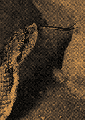
With another new week came another new brief, this time entitled 'How to...' Luckily for me the brief was a two week task, although I have to say it was probably one of the most obscure briefs that I have ever received in my life; let alone this degree. The first port of call was to pick a number from random that ranged between 01 and 1001. For no particular reason I selected number 677; which quite humorously correlated to the task of 'How to care for your snake' in the Collins book of 'How to do just about everything.'
My initial concept development led to obvious interpretations of how to look after a snake as a pet; a notion that the book itself advised me upon. As per usual however, I liked to make the task a little more enjoyable and subsequently progressed onto topics such as advertising for hair-care products (using Medusa as a mythological reference point) and caring for a snake with intention to consume it. The latter perhaps not in the snake's best interests, but after all a brief is what you make it!
From a particularly interesting crit, it soon emerged with feedback that the idea of consuming snake as a meat dish was by far the stronger approach; and so the development continued. The most peculiar product that I came across was without doubt snake wine; an alcoholic beverage that combined your average wine with a fermented cobra in order to let the venom pass through. Thank you for that Vietnam... I think I'll pass.
In struggling to finalize my focus down to a specific audience, I had a somewhat welcomed epiphany thanks to Glass-eye Gasi and his fond love for food. This resulted in producing a couple of final resolutions, the first being an instructional poster for chefs to prepare the snake for eating. The second being a complimentary recipe card for restaurant goers who would perhaps like to try preparing a meal in the comforts of their own home.
Here's what I came up with...

The theory behind this design lies in the way that the business card sized image would slot over the main A6 recipe card like a paper clip. In doing so the receipt would be secured and given to the customer in one neat little package.

This would obviously be laminated and situated within the workplace; in this instance the kitchen. I aimed for a very direct and informative approach that delivered clarity through both type and image. Photographs of the design in the real world will follow shortly as soon as I get back home and have a word with my old boss; I'm sure he wont mind.
Nice Nice
x
Tuesday, 17 March 2009
Re: Cog Resolutions
Sorry for the delay in updating my progress with this brief; have been exceptionally busy with this that and the other. You all know the feeling I'm sure. Here we go...
I eventually come up with a set of six final resolutions as I felt they all needed to be done. Multiple ideas were tackled with each of the given designs. The basic premise was either to create a card that could be given in the way that you would give a birthday card, or to alternatively create an interactive card that you would fill out yourself as a gesture of good will.
I finalised my decision based on what I considered to be the strongest resolution in terms of both aesthetics and theory - 'Thank you, you have been a star' and 'Thank you for thinking out of the box' were the two to make the final cut. I felt they possessed the strongest message and worked best given their layout and format.
A few coffees later I chose to submit 'Thank you, you have been a star' as my final entry to the competition. It conveyed a more accessible message that could be received by a much larger and broader audience; mass production was a consideration I was trying to aim for.
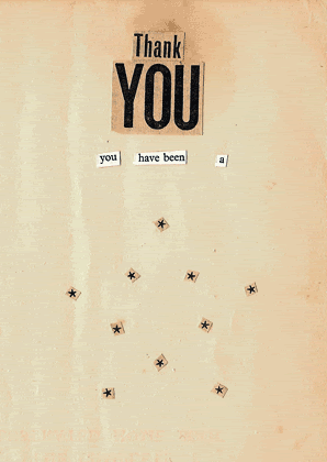
Thank you for listening, well... reading.
x
Subscribe to:
Posts (Atom)
